Dining Room Renovation in Modern Tudor Home
THE ROOM A formal dining room in an American Tudor home in the coveted Squirrel Hill neighborhood of Pittsburgh, PA
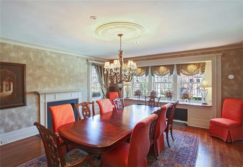
THE STORY My clients and I originally planned on building what we deemed a “Sophisticated Modern Farmhouse” in Nashville, TN. Their circumstances changed, however, and they relocated to Pittsburgh before we could break ground on the new construction. There they found a charming brick American Tudor house that needed a lot of love, and since we already had a great working relationship, they put me in charge. The original house had a lot of dark and heavy window treatments and dated faux wall finishes. The clients still yearned for the light and airy vibe that they had wanted for the original rustic house, but we needed to execute it in a way that was appropriate for the Pittsburgh architecture.
THE CHALLENGE Toning down the formality of the room without making it look too casual
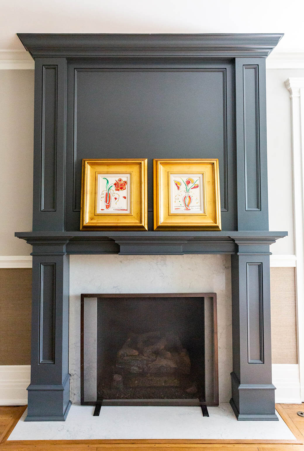
THE PROCESS The first design challenge I wanted to tackle was the fireplace mantle. It was so small and insignificant, almost like an afterthought. The scale of it made the 9 foot ceiling feel low. By extending the mantle to the ceiling and painting it a dark color, it became a design feature that immediately draws eyes to the ceiling. To contrast the dark color of the fireplace, I used a lighter color quartz, similar to a Carrara marble around the hearth and trim panels.
The next challenge was dealing with the wall finish, which had to be scraped off before we could begin painting. I wanted to dress up the walls by adding a traditional chair rail molding and then using Cowtan & Tout wallpaper underneath. By breaking up the wall into two sections, it gives the illusion that the ceiling is taller. Can you can see the trend here? I am always trying to lift the ceiling to give the allusion that the room is bigger!
The trim throughout the house was an off-white that had yellowed over the years. We brightened up the trim with a fresh coat of my favorite Benjamin MooreⓇ Simply White paint. The dark floors needed a facelift too. They were just too dark and formal for what we wanted. We refinished them and used a medium honey brown stain that evoked the warm and casual feeling we were going for. The contractor that finished the floors told us that he had never used a light color in a house in that neighborhood before. We were definitely bringing a more casual vibe to the formal neighborhood!
The existing chandelier was much too fussy for our taste, although we decided to keep the ceiling medallion since it had a lot of character. We liked the idea of a traditional candelabra-type chandelier but with a modern spin. The black finish is a fun twist compared to the traditional, common chandeliers that are oil rubbed bronze or brass.
THE RESULT: From dark, dated and formal to full of light, sophistication and drama.
BEFORE
AFTER
All photography by Abbie Tyler Photography, Pittsburgh, PA except for "Before" image


