Modern Equestrian Design- The Office Part 1: Before
Welcome back to the blog where we explore the next decorating challenge at the Hunter Design household. Every day when I walk into my equestrian bedroom, I am filled with peace, warmth and satisfaction. It’s the only room in the house that isn’t filled with some sort of a young child’s mess and chaos.
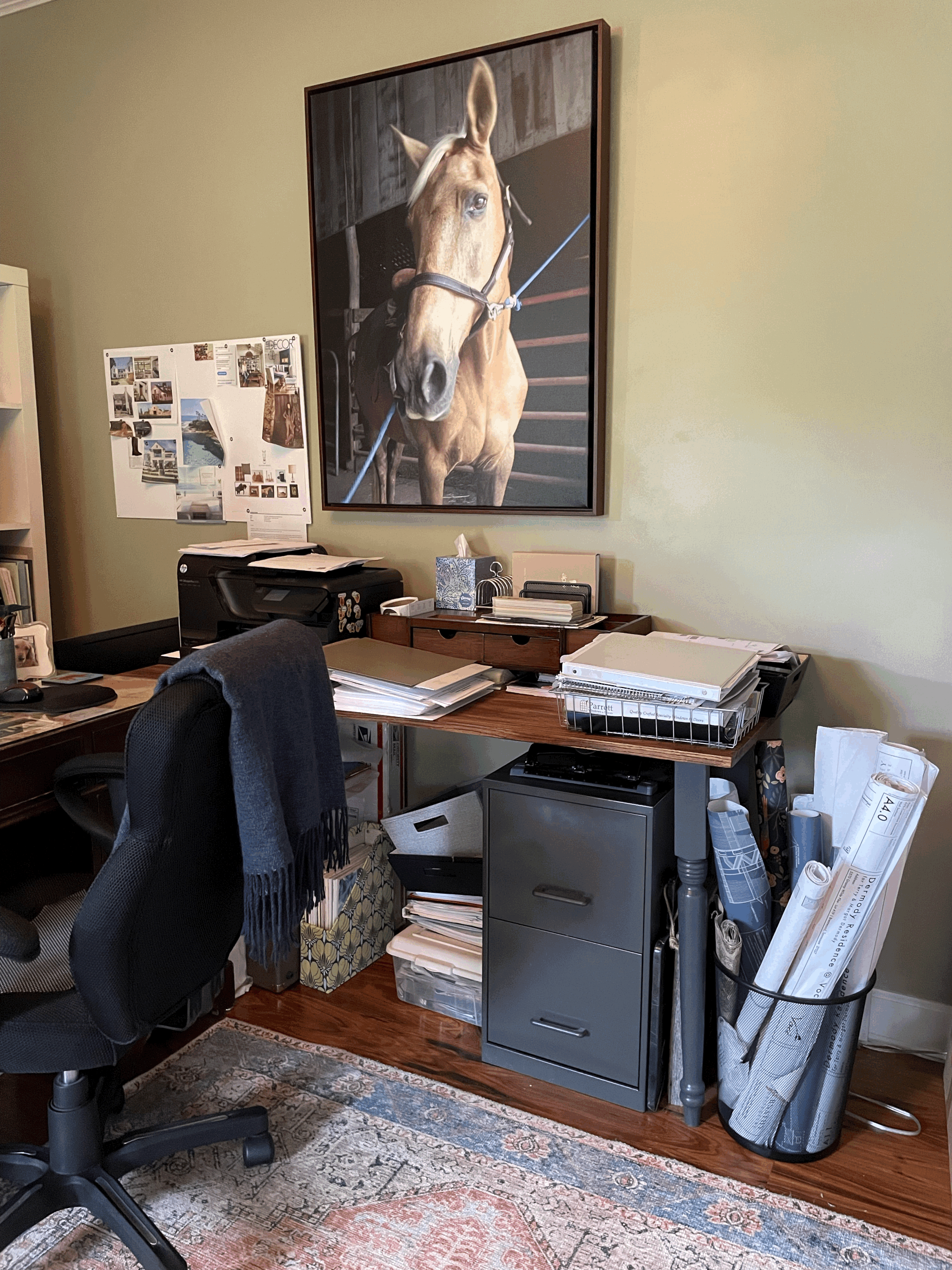
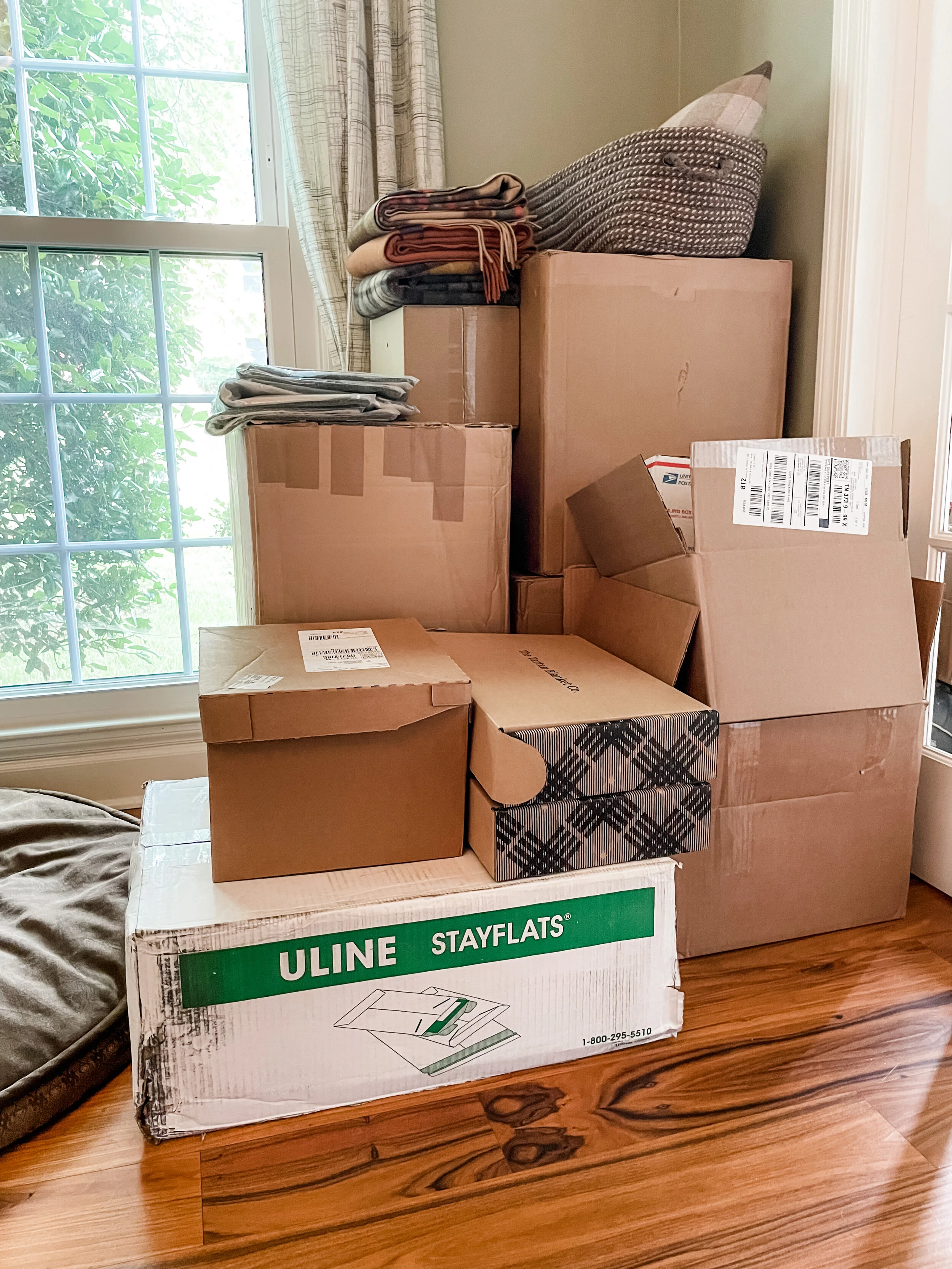
My home office is included in the chaos referenced above. I work as if I’m Albert Einstein’s protege, paper strewn about, fabric samples in stacks waiting to be filed away, paints and countertop samples pulled together for a meeting, client folders and binders stacked on the desk. And now with the addition of Modern Equestrian Shop, I have boxes upon boxes of inventory coming in, packing supplies and orders ready to send out. I walk into my office and immediately feel the impact of the disorganization and it overwhelms me. This is the last feeling one should have upon walking into the space where they are supposed to feel inspired, creative and productive. It is time to make my office space a priority, for the sake of my sanity and the health of my two businesses.
Let’s start with the corner that I literally have to trip over as soon as I walk in the door. That’s right, this is the first obstacle I face and it’s like a smack in the face and says, “Hey look at me!! You know, all that stuff you bought that now you need to sell? Get on it!” Then I trip over a bin full of tile samples that I recently took to a client meeting and then didn’t put back where they belong because I’d have to move some other boxes in order to get to the shelves where the tile bins are.
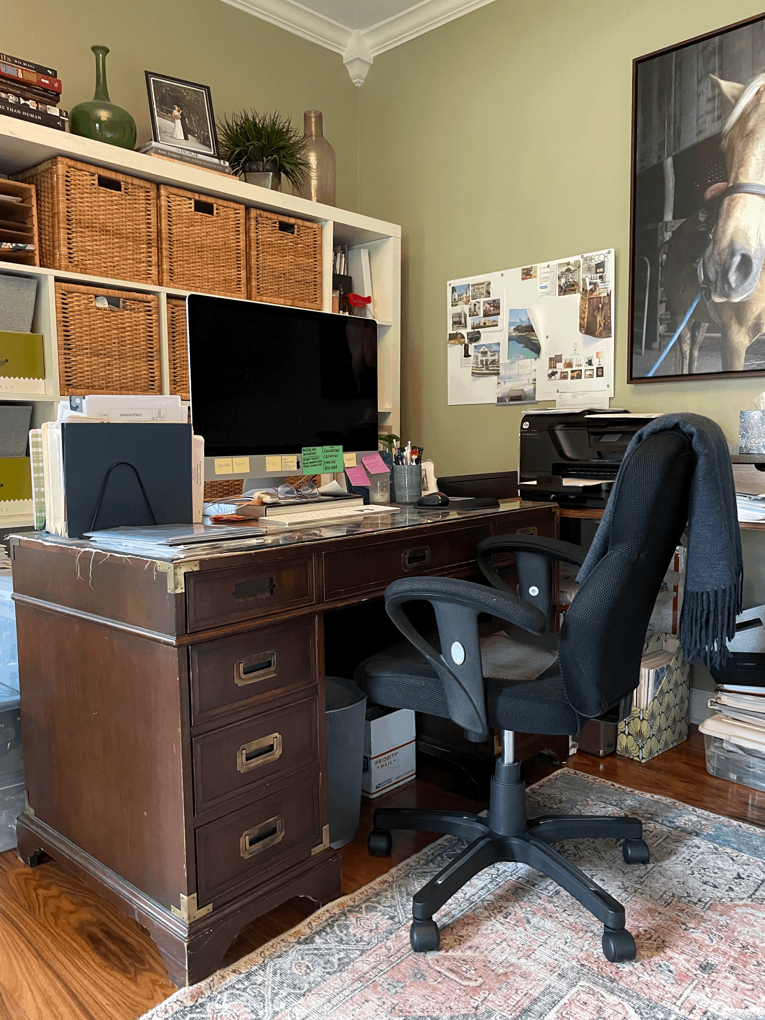
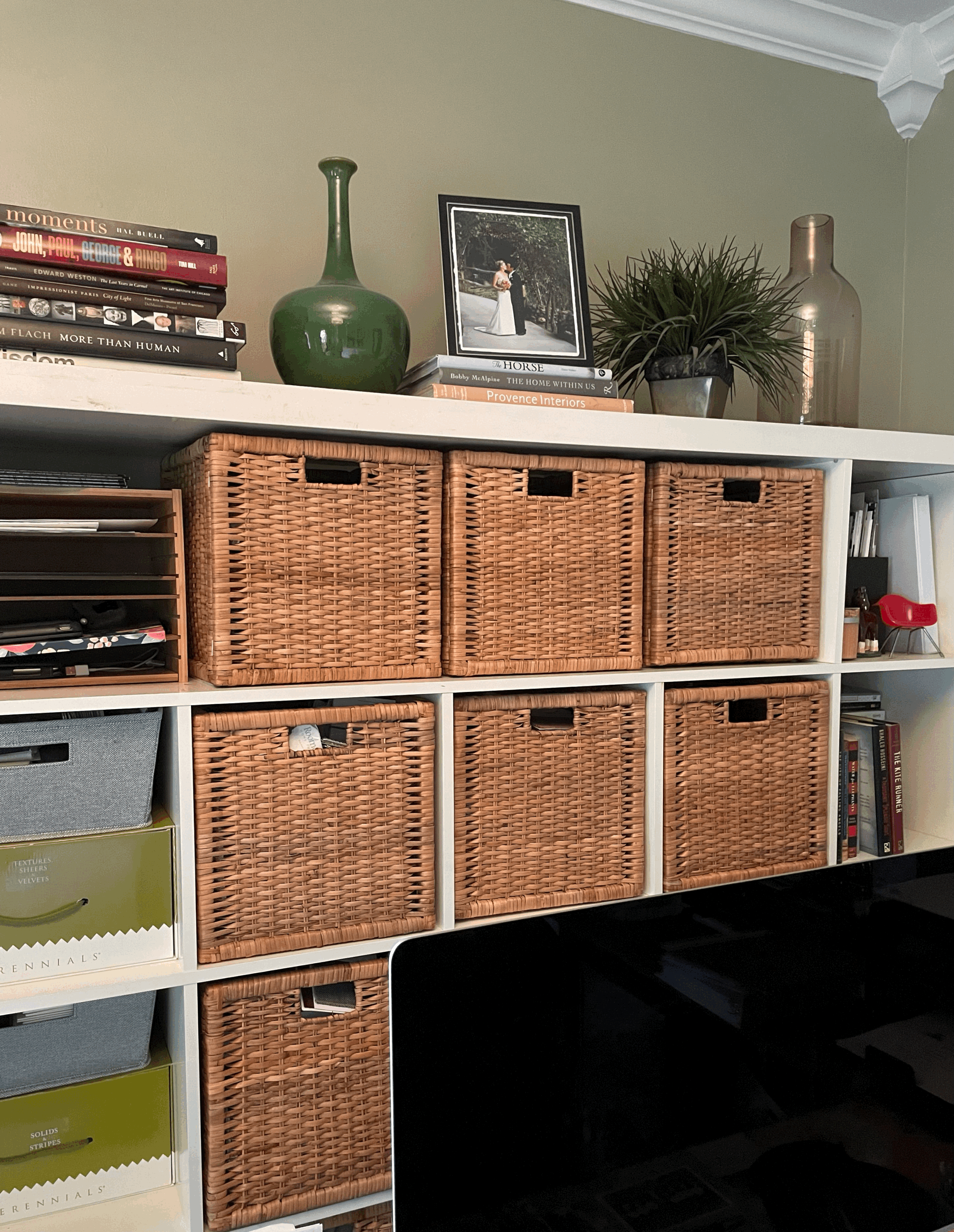
I used to have my desk against the wall so that the bookshelves were easily accessible, but when Covid started and I had to start taking Zoom calls, the lighting from the windows was terrible and also it gave people a view of the chaos that is my life. I quickly turned my desk so that my background was my built-ins and all of a sudden I looked very well put together in my Zoom calls. But I created a new challenge of accessing the baskets on my shelves. I had two computer monitors and a PC laptop with a docking station- it was a wiring mess and very ugly from behind, which is why I had the desk against the wall. Last year I switched to an iMac (best decision ever) and now I have a lovely back to look at and one streamlined cord- brilliant! I plan on turning my desk to face the windows in the middle of the room. This is a better power position because I will be facing the door while receiving the benefits of seeing the great outdoors. Can we say Feng Shui!
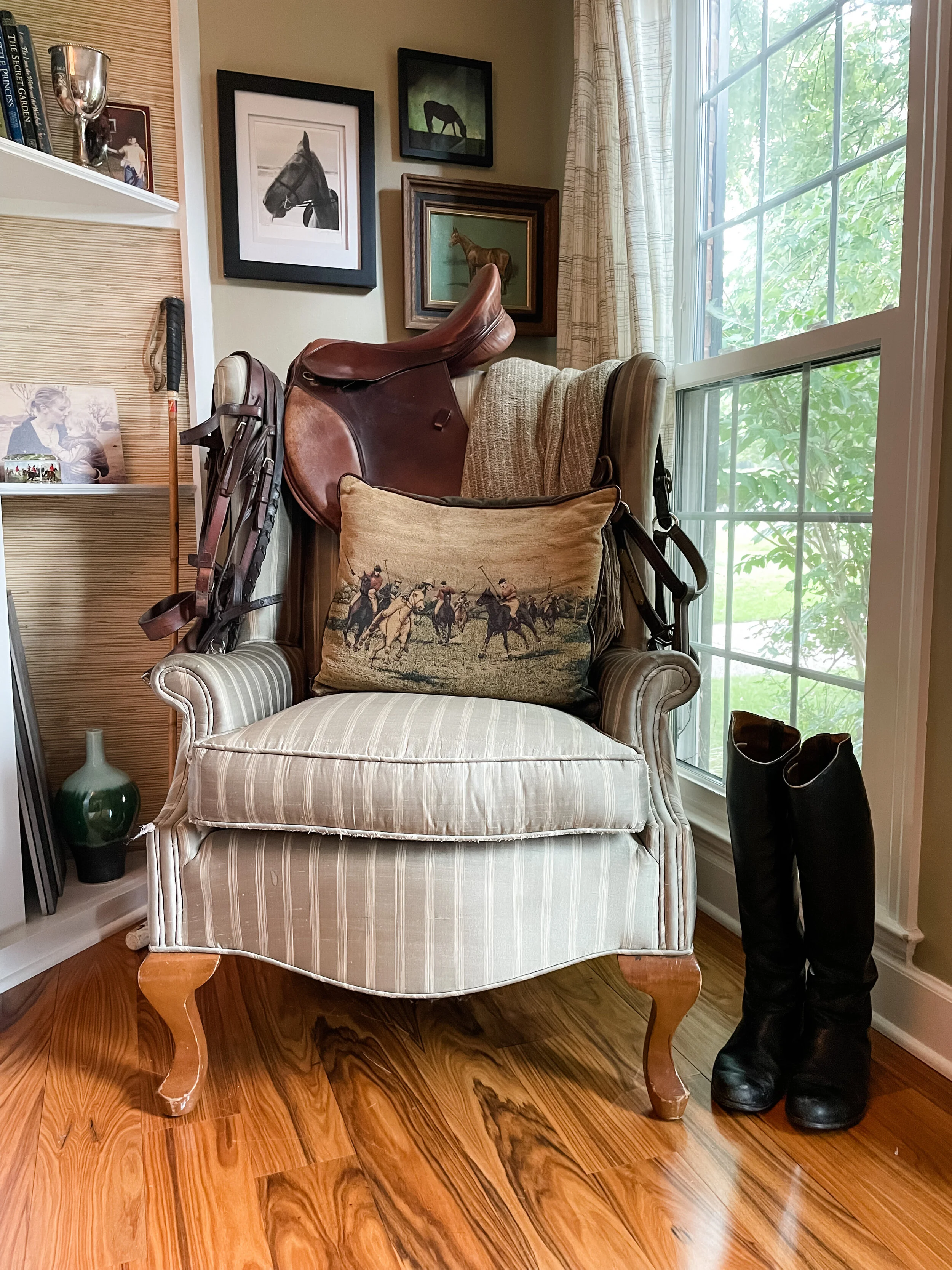
My parents bought this wingback chair in the 80’s and it has experienced many lives in different fabrics. It started with a brown and blue floral print, moved to English teapots and then to sage green silk stripes. It was give to me as a hand me down to help get me started in an empty apartment. I brought it across the country, even when most of our furnishings were purged in order to squeeze into a smaller U-haul. It’s where I sit when I need a quiet moment, and even though I predict the upholsterer will say that the cushion needs new stuffing, it still feels like a cozy green hug when I sit in it. Sadly, the fabric is wearing thin, silk is not the best for upholstery, nor have I treated it delicately. My plan is to cover it in a rich plaid of greens and browns, designed of course by Ralph Lauren, which will fit in with the equestrian library feel of the room.
Speaking of the “library feel”, it’s time for these IKEA bookshelves to find a new home (kid’s room) and to get bookshelves that feel more like me. The cubby shelving served its purpose for awhile and I am appreciate of that, but I am ready to have shelves that feel like an equestrian’s library. I found some bookcases with a black stain on the outside and a warm honey stain on the inside. I love the contrast and also, who doesn’t love a good ladder for a library?! I can see my kids hanging off of it. I am already regretting my decision. Oh well, they’re ordered. One thing I’m really excited about is that they are 16” taller than my existing shelves so they will go almost all the way to the crown molding. Do you know how much extra storage space that is?! Oh the books and Knick-knacks I can display!
Just like in my bedroom, Alice’s tack and memorabilia fill every corner. This saddle isn’t valuable in terms of a monetary amount. I bought it for $400 at a used tack store in 2005 and at the time I was just thankful to have upgrade from the saddle I had as a teenager. Spending $400 on a saddle can actually be somewhat freeing- I did not worry about it as Alice and I were cantering through the trees with my head against her neck until we were past the low hanging branches. This saddle was put to the test on every fox hunt and survived- with a few scratches and missing buttons. I scoured the internet to find replacement buttons for the saddle maker Lexington who was no more. And then I gave up and accepted that the wear and tear represented years of miles in the saddle with my girl.
The bedroom project was about creating a relaxing environment and being able to create something in my equestrian style, but this office project is so much more than that. This is about creating a space where my creativity and productivity can flourish. This will be a space that makes me feel inspired when I walk through the doors, and that lifts me up rather than zapping my energy. I have received so much love and support for my bedroom design, and it makes me so excited to share this journey with you as I search for my sanity in my English Library.
Stay tuned for Part 2 of the transformation, featuring Paint. To be continued…
